In this project, I developed a comprehensive brand identity for EAT GmbH, a company specializing in high-quality convenience food. The goal was to create a cohesive online and offline presence that would strengthen their market positioning and visually communicate their commitment to authentic, natural ingredients and high convenience.
services
The challenge was to establish a consistent, memorable brand presence for EAT GmbH, spanning print and digital media. The company needed a strong identity that would set it apart in the high-convenience food sector while reflecting its authenticity and commitment to quality.
design
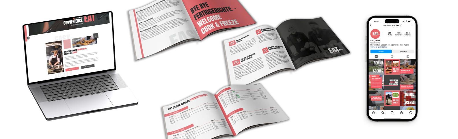
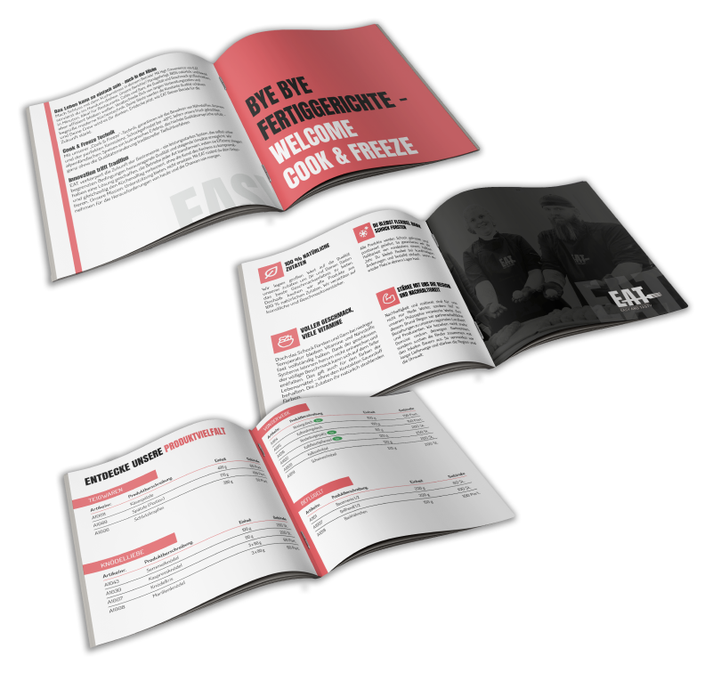
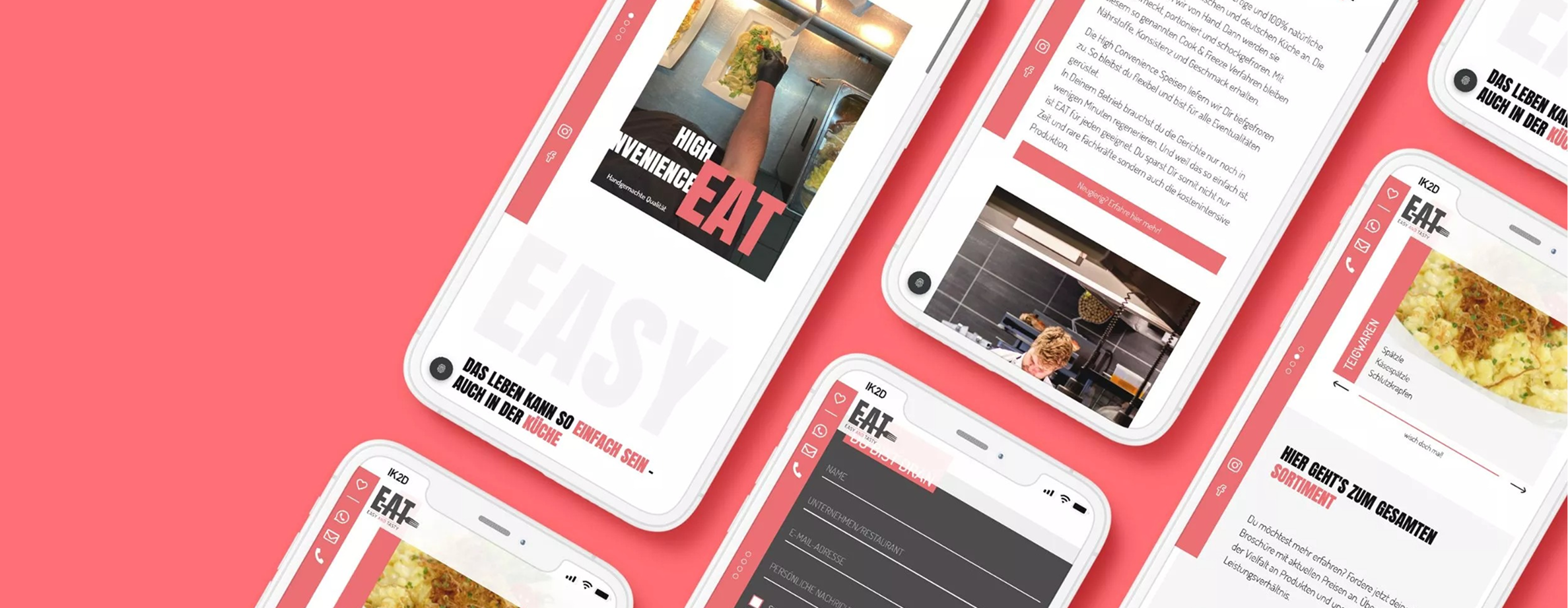
I created a cohesive visual identity that reflects EAT GmbH's dedication to quality and innovation. This included a clean, modern logo, a responsive and visually engaging website, and a polished corporate brochure.
content
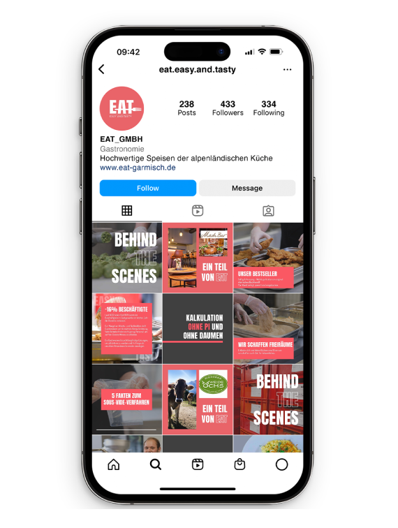
I designed social media assets for their Instagram account to enhance their online presence and engage with their target audience.
Implementation
Ensured that all elements—from the website to print materials—were seamlessly aligned with the company’s brand values and message.
Corporate Identity
Created a corporate identity, including consistent brand colors, typography, and imagery that enhance brand recognition across different media.
Website Design
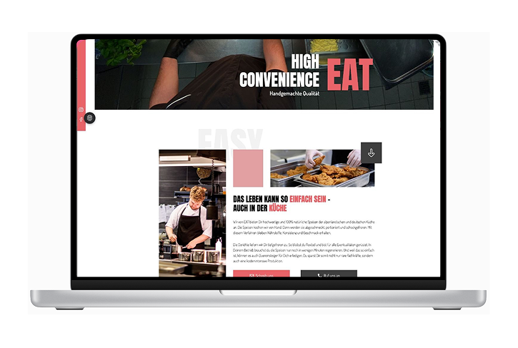
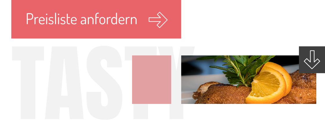
a responsive, user-friendly website with focus on showcasing products and services, integrating visuals and clear navigation.
Brochure Design
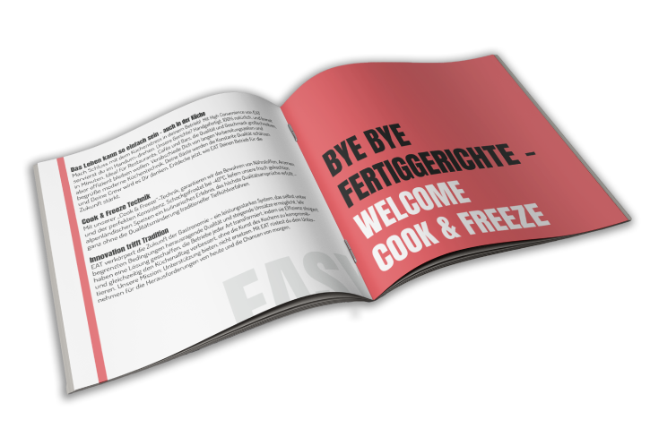
A detailed product brochure featuring the company's offerings, designed to be both informative and visually appealing.
social media
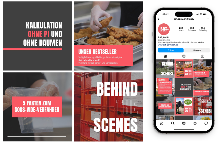
Curated Instagram content with a focus on storytelling, behind-the-scenes insights, and vibrant imagery to strengthen the brand.
colors

Bold red adds freshness and dynamism, while grey represents stability and professionalism.
logo derivation
The EAT logo features bold typography for recognition, with a fork integrated into the “T” to emphasize the food concept. Its minimal design and red, black, and white color scheme convey quality, energy, and authenticity, ensuring a modern and timeless appeal.
design system
The design system strengthens brand identity with a professional yet authentic look, ensuring consistency across all channels. Playful yet subtle typography reinforces the brand message, while behind-the-scenes photography enhances transparency and trust.
Establishing a Consistent Brand Identity
Developing a cohesive brand identity across multiple platforms is essential for building trust and recognition. By aligning the print and digital materials, I strengthened the overall brand experience.

Effective Social Media Engagement
Tailored Instagram content that showcases authenticity and behind-the-scenes elements to connect with the target audience in an engaging, relatable way.