In this project, I brought McDonald’s McS!P rebranding to life by creating a bold and dynamic website experience. Inspired by the vibrant new logo, energetic color palette, and playful typography, the design reflects the fun and refreshing essence of McS!P. Interactive elements enhance the user journey, striking a balance between modern energy and nostalgic charm, perfectly capturing the spirit of McDonald’s new cocktail and fun beverage initiative.
services
The redesign of McDonald's drink offering with McS!P, which focuses on fun cocktails and vibrant branding, required the redesign of the visual identity and the creation of a dynamic website that emphasizes the playful spirit of the brand redesign.
research
Conducting user interviews and analyzing fast food industry trends as a basis for design decisions.
design
We developed a cheerful, playful and warm-hearted design system in line with the fun and refreshing nature of the new brand.
Development
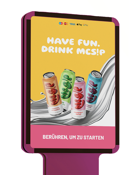
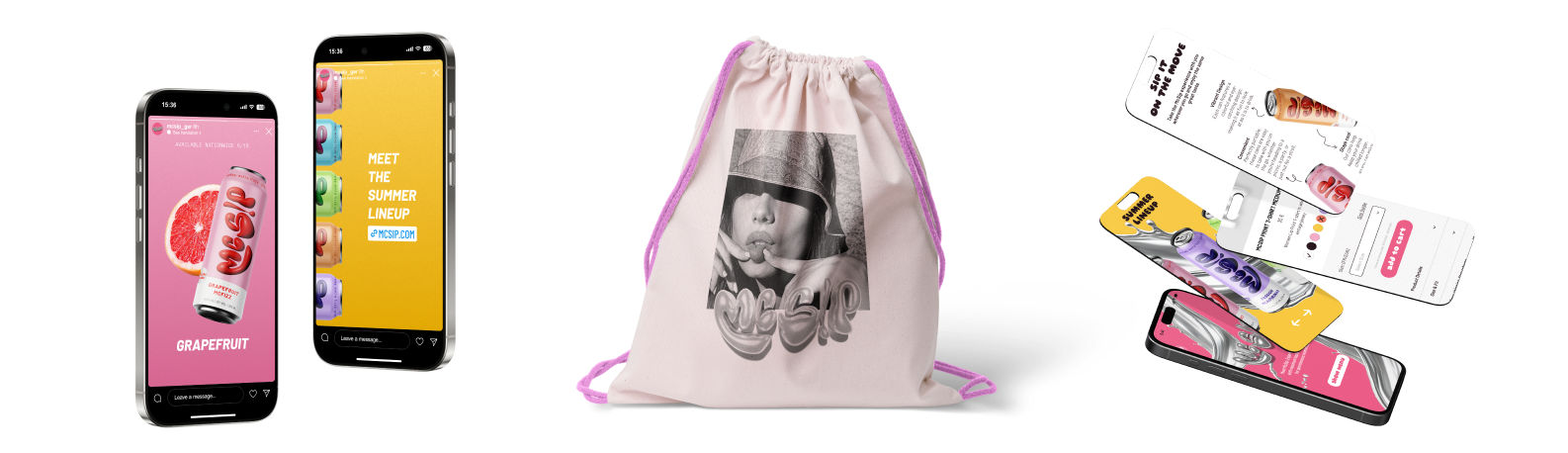
Implementation of interactive features and animations to ensure the website reflects the playful and dynamic identity of the McS!P brand.
user interviews
Conducted 10 interviews with target audiences to understand their preferences and expectations for branding of funny drinks/cocktails and digital experiences.
services

Nightlife feeling
The target group wants a design that reflects the feeling of freedom, adventure and partying - something that reminds them of the vibrant nightlife.

approachable brand
A friendly, easygoing tone and a design that appears “cool, but not arogant” are popular. The brand should feel approachable and like a part of their lifestyle.

Playful interactivity
Small animations, surprising details and interactive elements create a fun user experience and are memorable.
social media friendly
Visual highlights that are easy to share on social media are important. Colorful cocktails and stylish, eye-catching elements make the brand “instagrammable” for young people.
look and feel

A playful, eye-catching font that is inspired by drinks cans and creates a relaxed, fun atmosphere.

Modern, clear, easy to read and complements the main font with its simplicity.
photography Concept
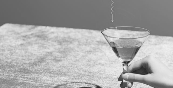
Refreshment and enjoyment
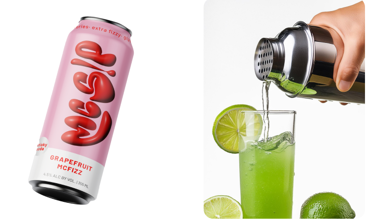
Captures the sparkling freshness of drinks. Lively images of cocktails in stylish glasses leave you craving for more.
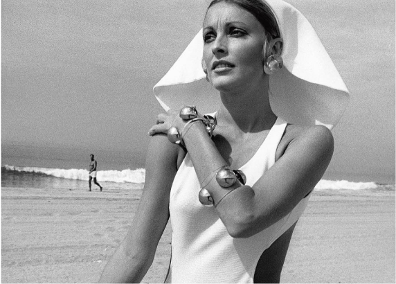
Nostalgia and relaxation
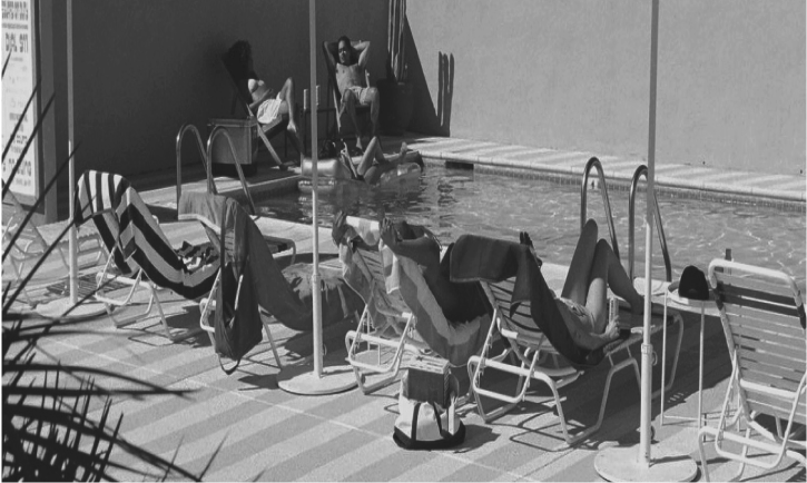
Retro-inspired scenes create an inviting and nostalgic atmosphere. Images invite you to lose yourself in a relaxing environment.
Dynamics and variety
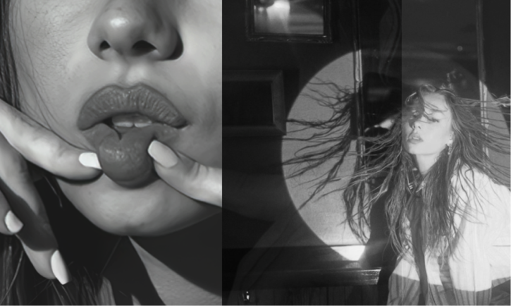
Dynamic black and white images and colorful illustrations of the beverage cans emphasize vibrancy, energy and variety.
color, animation and illustrations
colors

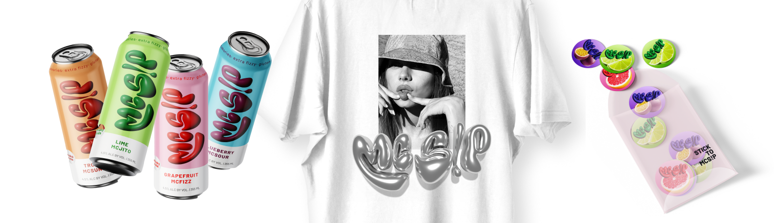
logo derivation
The McS!P logo combines a metallic look, beverage cans and disco balls, to evoke party vibes. The rounded letters reflect the movements of dancing and the exclamation mark with a dripping dot in place of the “i” symbolizes refreshing drinks.
illustration

Retro-inspired scenes create an inviting and nostalgic atmosphere. Images invite you to lose yourself in a relaxing environment.
Balancing Playfulness and Functionality
In developing the design system, I introduced a joyful and vibrant tone to align with McS!P's identity while ensuring clarity and usability. User testing confirmed the design's ability to engage users while maintaining a seamless
and intuitive experience.

Creating a Cohesive Brand Experience
Combining branding, visual identity, and user-centric design ensured a unified experience that resonates with users and strengthens McDonald's position in the fun beverage market.